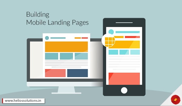
Since more users are now using mobile devices to browse the Internet. The mobile browsing experiences is given emphasis by IT professionals and mobile development experts. Designing and developing for mobile platforms has to have a different approach as the device’s screen size varies. Therefore, it is unlike the user experiences created for desktops.
The landing pages for mobile pages needs to be customized for every screen size and different browser i.e. making your desktop version responsive. Going responsive provides you with a web solution that is optimal for viewing across multiple browsers and devices. So how do you really please your mobile users?
Goals for Mobile Users
The catch is that the screen size, device type and context can totally affect the user experience on the website and what they wish to do on the platform. Web development experts say that mobile users are not buying the same products or services on the mobile as they may be buying while browsing on the desktop. Desktop is still considered as a better channel to expect conversions than the mobile devices like the tablets or the smart phones.
Customers and users are more comfortable buying on the desktop of course because the view is bigger and thus the customer feels surer while viewing on a big screen. Whereas in a small mobile screen, the view may be small and they may affect the buyer’s psychology to make a decision. But this hugely depends on the kind of business and the mobile experience.
From our analytics report, we have understood that customer and users tend to research on the mobile site while on the go and finally make the purchase from the desktop. Mobile payments are also one of the reasons for such transactions as many users consider making transactions safer from a desktop device than a mobile device.
Suggestions:
- Lower examination is better for mobile experiences than that solution that takes a lot of information and a major buying decision.
- Having a mobile version is necessary, because that could lead to a conversion later on the desktop, so it is more like a first step before conversion.
- Effective user experience for mobile version, minimal content and high resolutions optimized images for mobile view.
Faster CTA’s
When your customers are browsing your website on the desktop, they have a larger screen and thus, more features can be accommodated with importance to each element meeting the visual hierarchy. As a team of web development experts, we understand that customers and users first need to gather the information and check the same on the other platforms if available elsewhere. While this process, the mobile device comes handy! So while you are creating a mobile landing page as responsive, you need to ensure that it is easy for your customer to be able to make a call from that page itself. This way, you can have the opportunity to convert the customer from the mobile site itself.
Suggestions:
- Use buttons like ‘Shop Now’ or ‘Call Now’ or ‘Book Now’ as Call to Action gateways.
- Make sure the mentioned number is in the HTML and it is a click to call ready which means, once the customer touches or clicks on that button, the call is being dialed.
- ‘Call Now’ buttons have higher rate of conversion than suggestion clicking here to see the contact details.
- For marketing professional, optimizing the lead generation forms with mobile can be a good way to increase the conversion rate.
Typing can be Tedious – Get Rid of It!
Once you are done making the mobile landing page responsive, you need to know whether you need the call buttons, if you don’t then you know of the primary goal for conversion. You can generate and reach out to your leads with the help of form. Using drop down menus and selection from the fields can result in reduced typing and thus the leads can get away with the tedious process of typing. Users are not very fond of typing while browsing on the mobile phone, so they might take a step back to finally take the call!
It is all about reducing the friction and the time taken to fill those forms. It is important that you cut on the form fields for the mobile version according to the mobile development specialists.
Suggestions:
- Remove most of your optional fields for the mobile version of the landing pages and consider removing the extra fields too.
- You can also optimize the mobile opt-in forms and expect your users to fill out your forms with minimal typing.
- Things that you remove, you can qualify or ask the same on the phone once it comes to the stage of calling.
- Select those fields that are of priority for generating a lead.
- In the mobile forms, you need to ensure that there are different input fields that are automated to switch to the mobile keyboards.
- To reduce typing while browsing the mobile landing pages can be through social media logins to fill forms and mobile payments.
Don’t forget Slow Internet Connections
It is not still possible that users have strong and fast internet connection at all times, this depends on many factors like location, device and service provider. This is one aspect the web developers need to keep in mind while building mobile responsive landing pages. This is specifically in the case of mobile devices, because here the signal strength can keep varying.
Moreover, mobile users have slower attention spans and slower internet connections make the whole experience even more frustrating. When you think that it is not necessary to optimize your mobile website, then you may be going wrong. It is equally important because then your mobile users might just be really frustrated after using your site. A study highlights that more than 43% of users are unlikely to return to a slow loading landing page or website.
Suggestions:
- Make sure the images for the mobile website are optimized for the slow internet connections too.
- Using scalable vector graphics instead of very heavy real images where comprising a little on the resolution can give the site loading a boost.
- Avoid using images with text in HTML, program all the typography in HTML.
If you are looking to convert your clients through your mobile platforms, you need to go responsive first. For this reason, you need to follow the good practices of building the mobile landing pages.
Here, at Helios, we ensure that your end users and customers are not disappointed at any level while on your website – desktop, tablet or mobile phone. Give us a call, we shall test your website to know whether it is following the good practices of mobile landing pages and has the ability to please your customers!