Conversion rate enhancement is an enormous issue for any online organization. Businesses want to convert site visitors, yet don’t want to appear pushy or edgy; hence, lets’ have a look at few tips to boost the online forms.
Build Conservatively And Design With A Purpose:
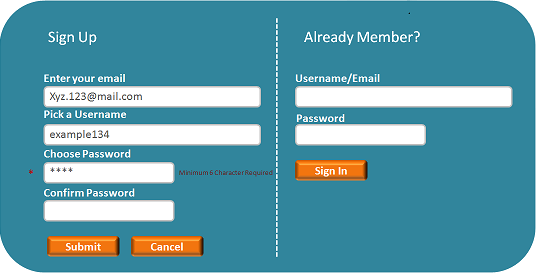
No one really likes filling out a form on a website. Hence, it is important to keep it short and simple and to eliminate things that are absolutely unnecessary, or do not offer any tangible benefit. It is necessary to check all the information on the form is pulling its weight, and the visitors will thank you.
The structure of the form is meant to serve the same amount of functional reasons as its components. The design of the form should be user friendly with proper placement of elements. It should not look scattered or haphazard, make sure everything is evenly spaced and neatly arranged.
Be The First To Communicate:
It is important to make sure the elements in the form are user oriented. Here’s a trick that can be used, pretend to be talking with the user, for instance, if you want to know someone’s name instead of inciting the user with the label “Full Name”, have a go at something minimal and more friendlier like, “What’s your name?”
Divide The Form Into Bite-Sized Sections:
A good conversation is where the information is unfaltering and in a back and forth flow. A form is just another method of online conversation. It is important not to toss a considerable amount of information at the user in a huge block. Also, you should attempt to use even controls, hued bars, genuine designs, and headings that match the designs of the site to separate the information into small, easily understood chunks. As a last resort, spread the form across various pages and also include an advancement bar over the top for the users to know how much they’ve left.
Include Meaningful Contextual Error Message:
The error message ought to be helpful and clear. Let the users know particularly what created the error and highlight the label or the field itself. After, all nobody prefers chasing through the form for a tricky field they overlooked the first time around.
Release The User:
After the user clicks the submit button they are basically saying “here’s your information, talk to you later!” in a real conversation we would say “bye” as a form of acknowledgements. The form should not be any different. Have the form programmed to send the user to a custom page that tells them something like, “Thank you for your submission! You will be hearing from us shortly”. You should also have a link attached which will take them back to the main page of the website.
Keep these rules in mind while designing a web form and be surprised at the quantity and the quality of the feedback you might receive, which results into boosting the effectiveness of the form.
Do get in touch with us if you want to know about our Web Development Team and Projects in more details https://www.heliossolutions.co/web-application-development/